L’Oréal Skincare.com & Makeup.com
Skincare.com and Makeup.com are destinations for all things beauty for anyone from expert to novice. They serve up tips, tricks, round-ups, expert opinions, and more across site, social, and email.
The Ask: elevate the existing, younger branding; each site should have their own style, but still feel like sister brands; create templated banners for site and new design direction for social and email
Role: Lead Designer
breaking down the brands
I identified the elements to change and to keep based on the brand characteristics
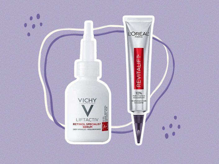
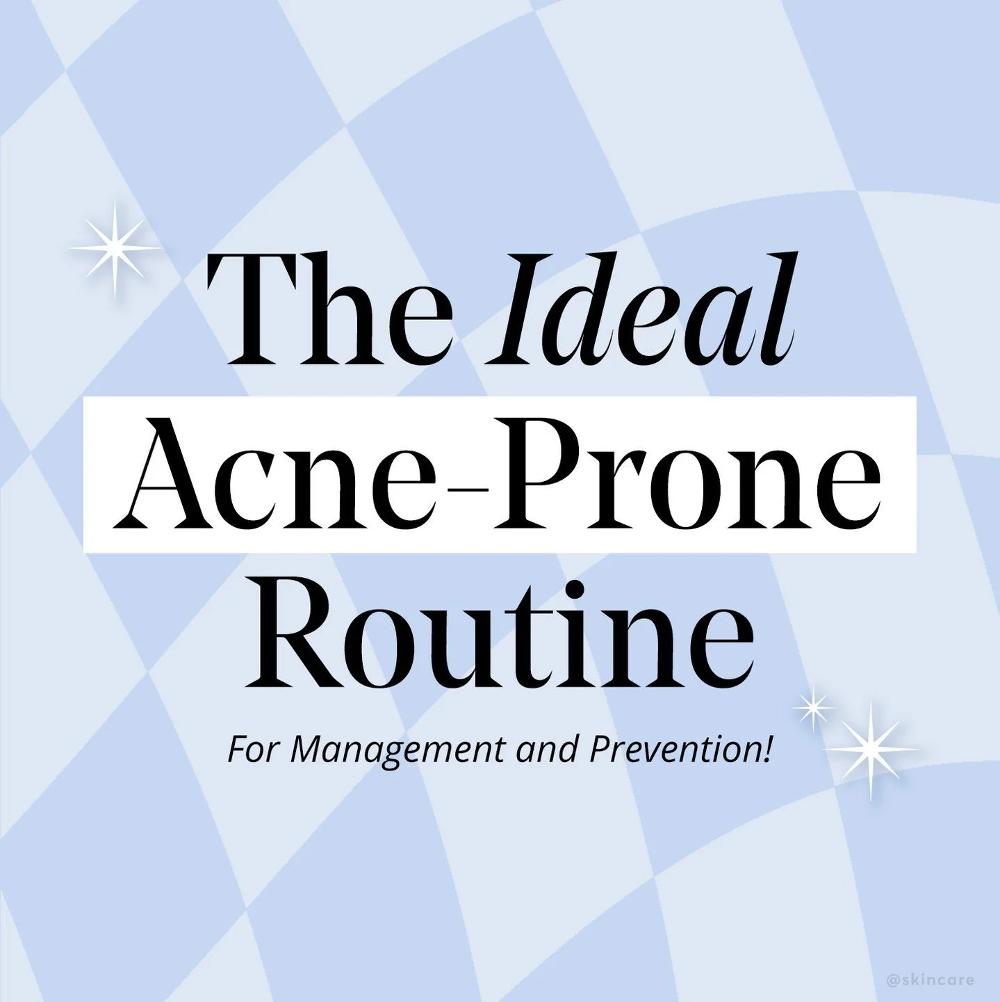
✧ skincare.com is trusted, scientific, human
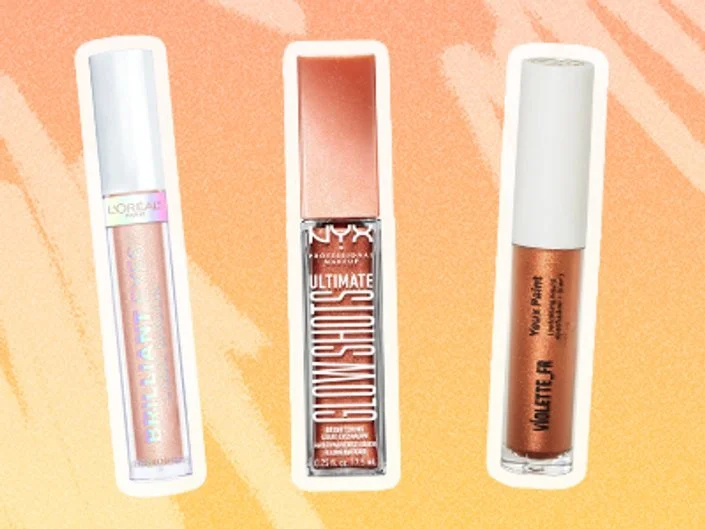
✧ makeup.com is fun, bold, approachable

removing the outlined products like a sticker

keeping the products as the focus
removing the hand drawn shapes and the patterns

keeping the textural elements
removing the bright gradients
removing the flat drop shadows
skincare.com
✧
skincare.com ✧
The branding
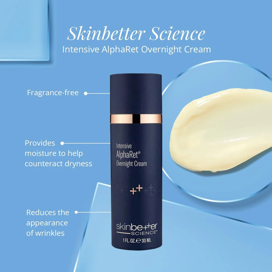
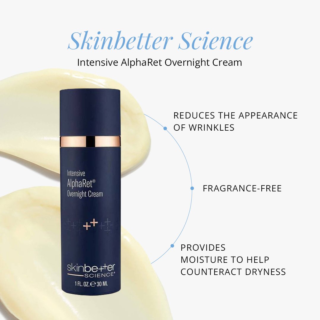
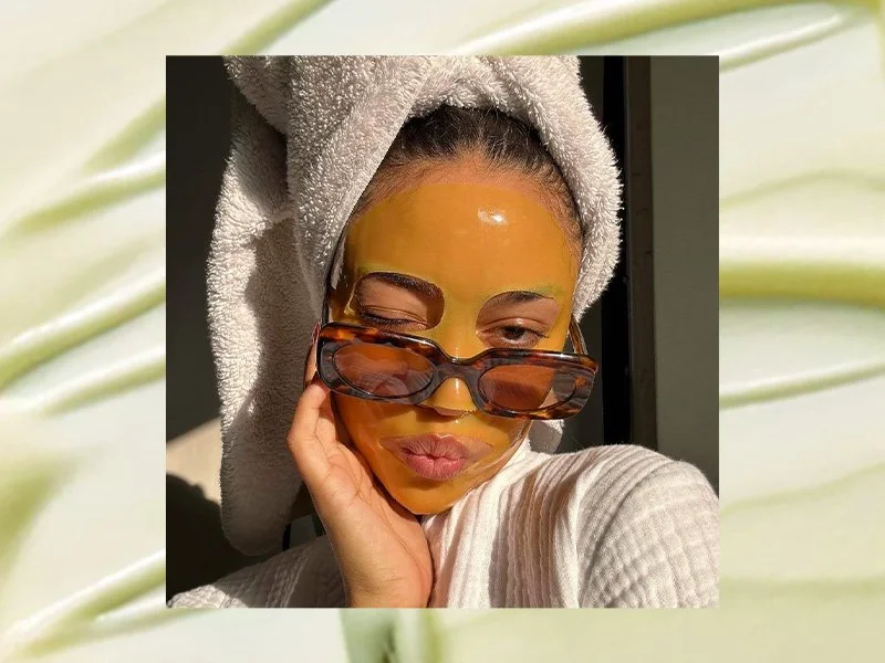
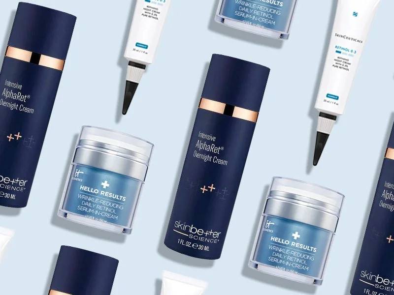
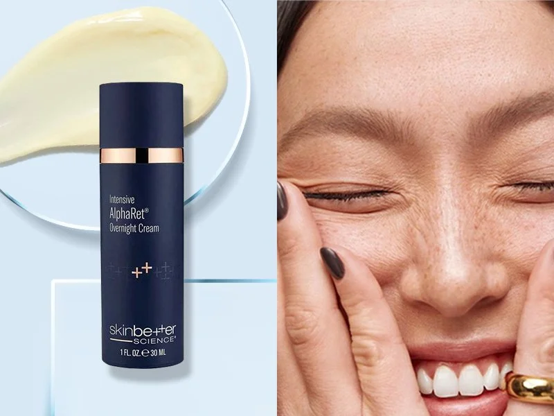
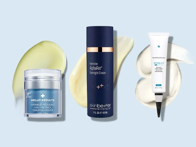
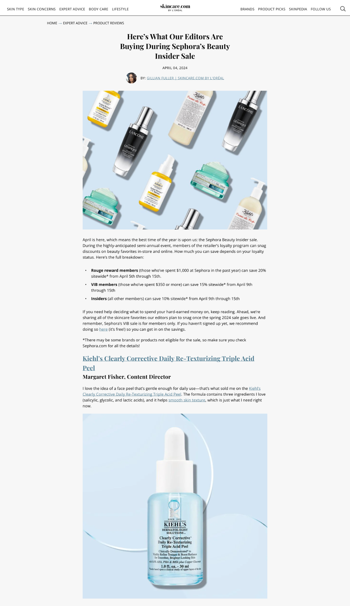
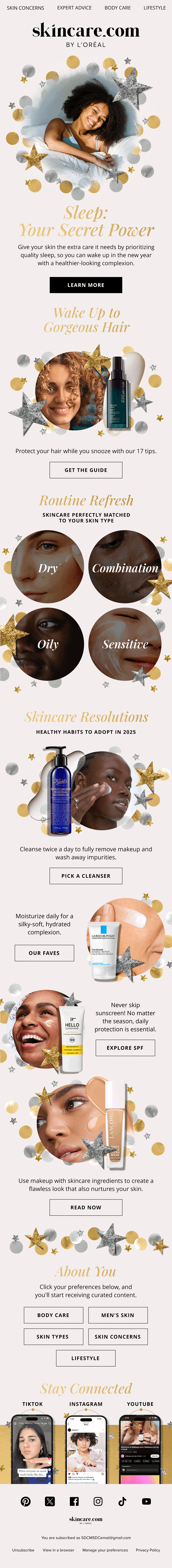
I kept the original bones of skincare.com—logo, colors, fonts, but with updated usage. I also utilized product textures, glass slides, soft shadows, simple geometric shapes, and lots of people and their skin. The combination of these components create a strong visual that emphasizes trusted, science backed information with a true human touch.

On social

On site
In email
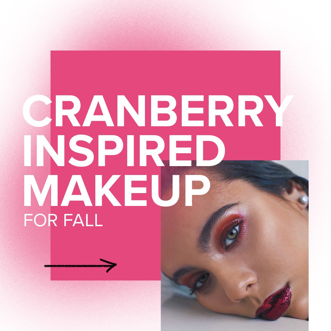
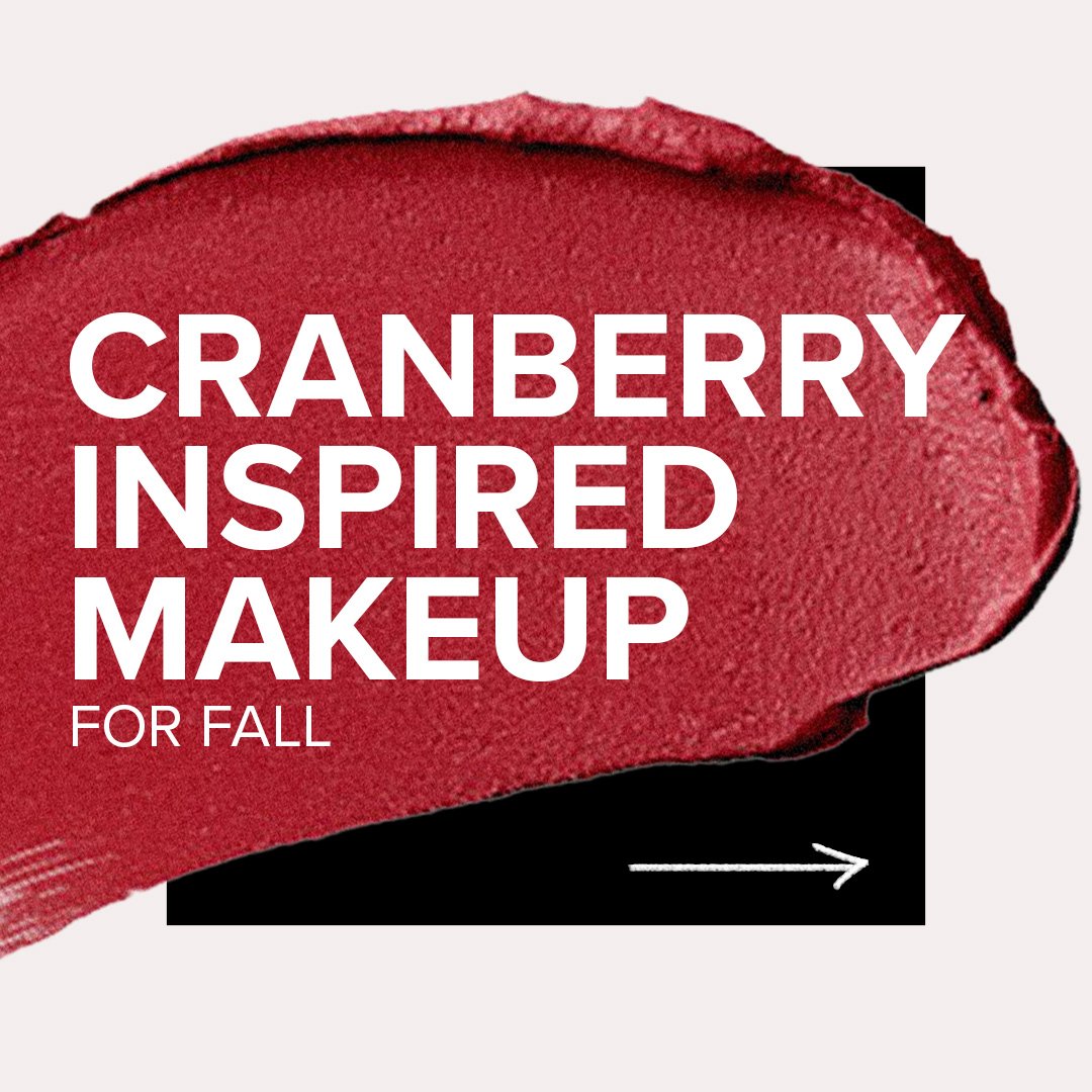
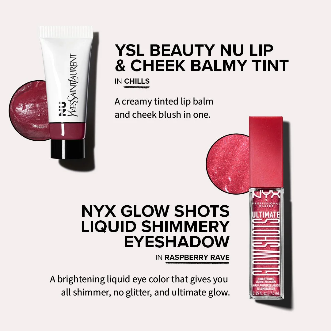
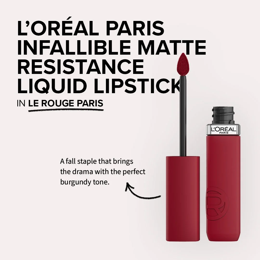
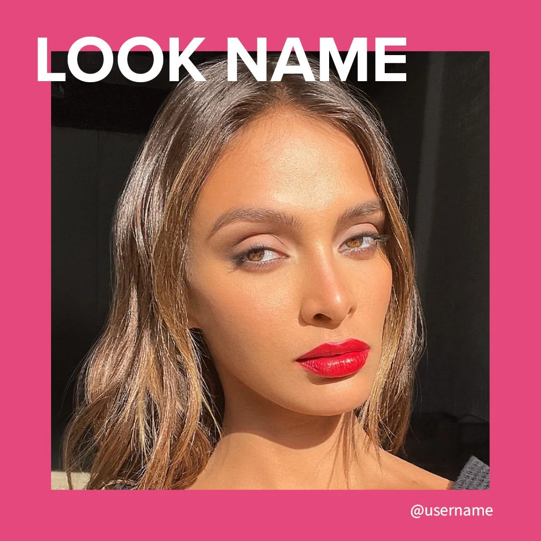
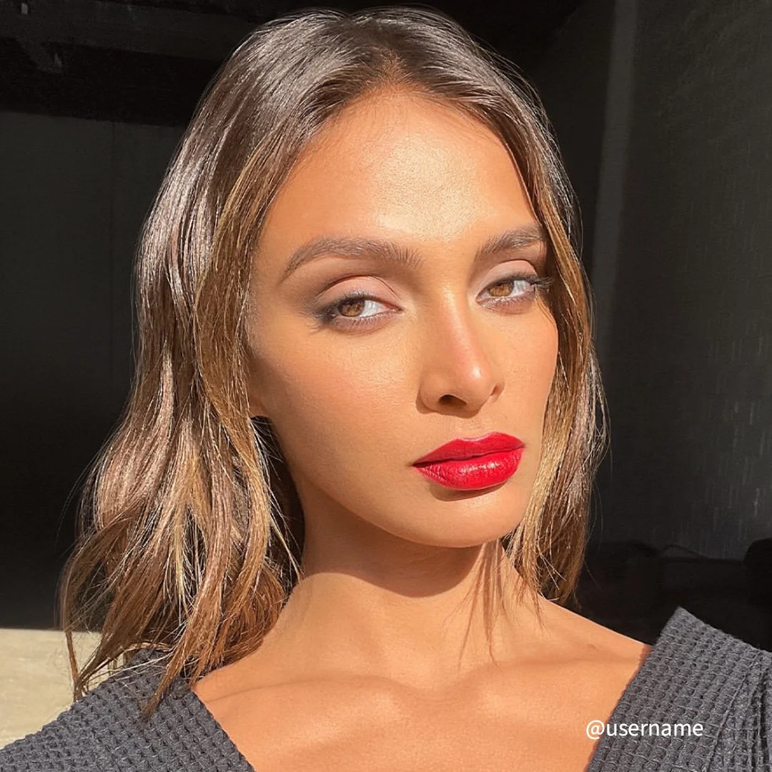
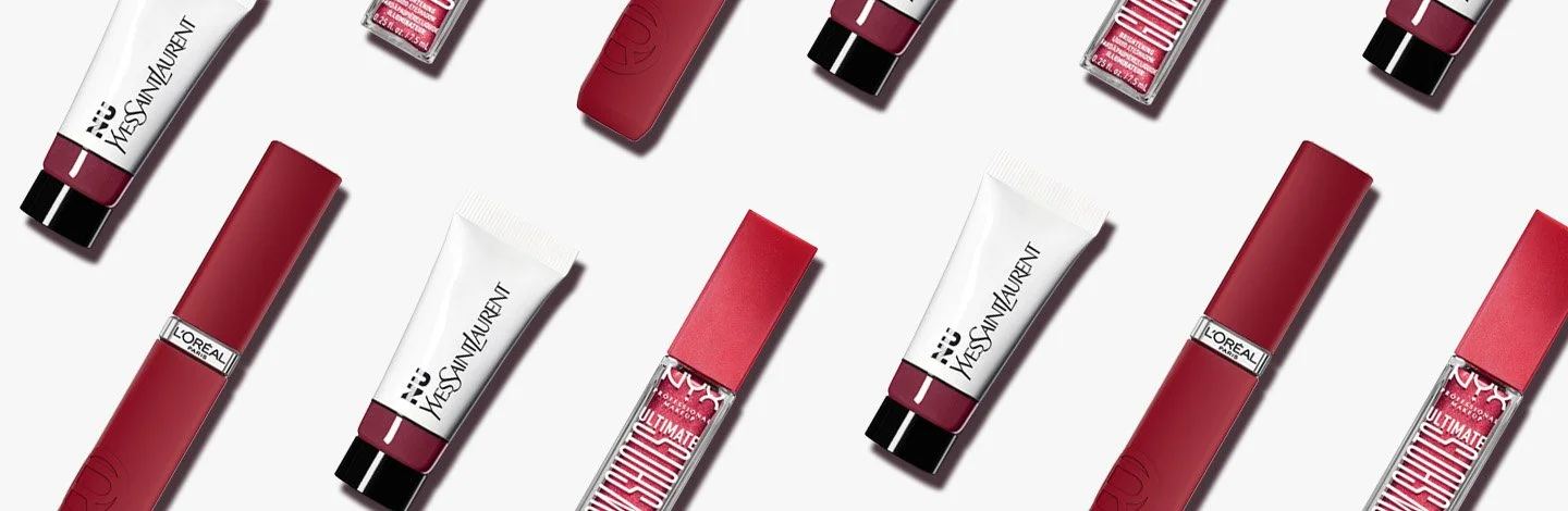
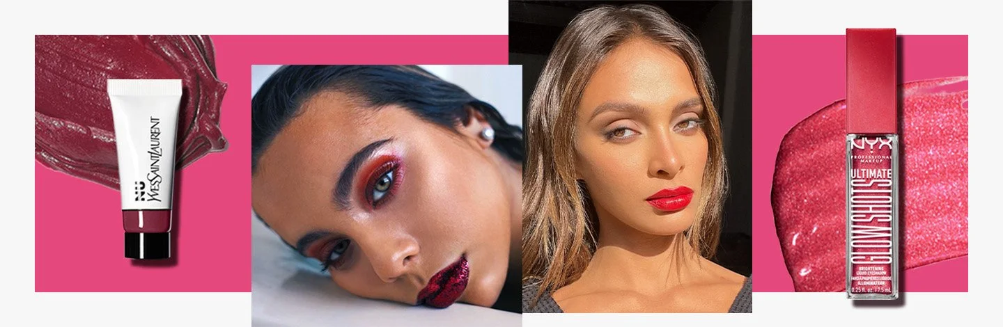
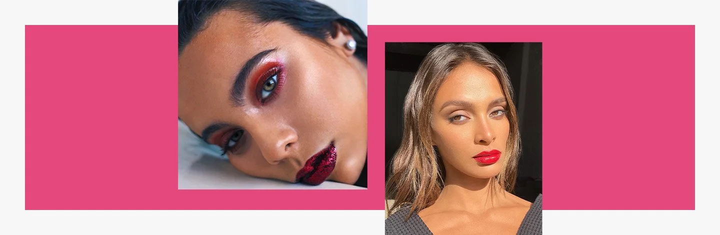
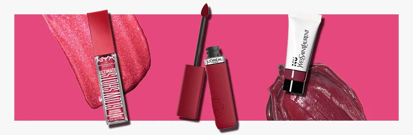
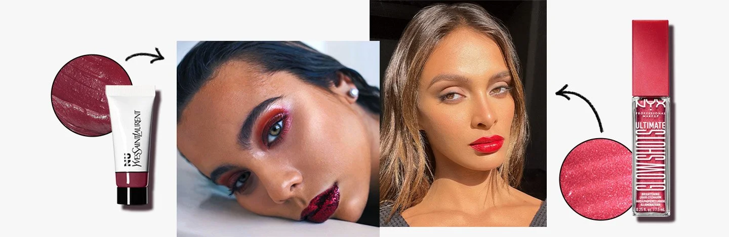
makeup.com
✧
makeup.com ✧
The branding
Just as with skincare.com, I kept the original bones of the branding—logo, colors, fonts. I removed the multicolored gradients in favor of utilizing single colors in flat color blocks or soft glows. I leaned on product textures, products, and UGC to showcase the fun, bold attitude of makeup.com.
On social
On site
In email